%20(2).svg)

.svg)
.svg)


We’ve all been there. Cohort analysis is quite the feat (especially when you're doing it manually in Excel!). If you’re giving it a go, there’s a good chance you’re here trying not to scream at your computer screen.
Cohort analyses are invaluable to any SaaS business, but the difficulty of completing them scares many business owners from using them to their fullest advantage 🛠. Once you complete your analysis, it can also be daunting to read the output and gain actionable insights!
Let’s get started by looking at an example cohort chart, which is an organized table of metrics relating to the behavior of customer cohorts. We’ll explain all the features you see here in a minute.
We're here to help. Read on to develop a deeper understanding of cohort analysis in a really approachable, step-by-step way!
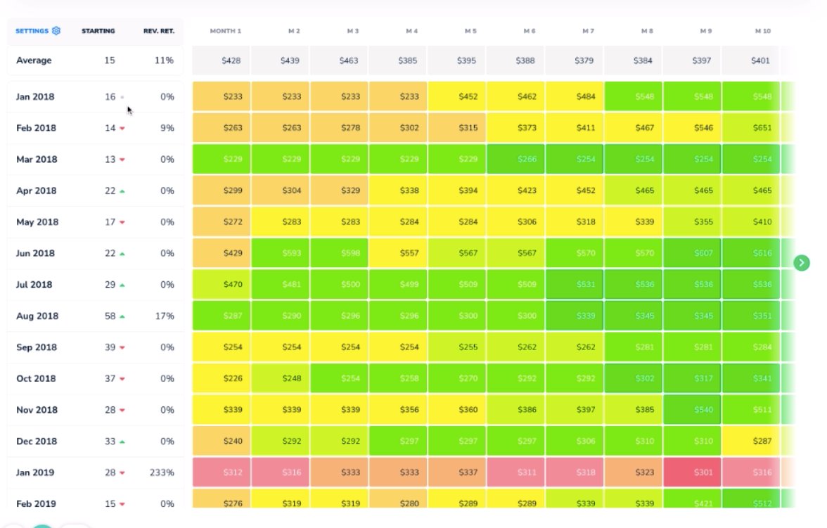
Help! What do all these numbers mean?
In the column on the far left side of the page, you will see a list of months. These are your cohorts. Directly to the right of that column is the number of clients in that month’s cohort - in other words, the number of customers that joined during the given month.

So, there were 16 new customers in January 2018 and 13 new customers in March 2018.
Now, let’s look at the next column. Here, and at the top of every column thereafter, you’ll see the average amount of recurring revenue generated by a cohort in a month, but take note! These aren’t calendar months - they’re months in the life cycle of the customer. So, the M1 column represents the first month the customer was with you, the M2 column represents the second, and so on.
In our example, the January 2018 cohort (the first cohort listed in the column) generated $2,797 in ARR in their first month. For the second month (which is February 2018), their ARR remained the same.

Contrast this with June 2018’s cohort. In the first month, the 22 customers in this cohort generated $5,149 - but in their second month (July 2018), their ARR goes up to $7,112! 👍

Recall that for the January 2018 cohort, the Month 2 (M2) field represented February 2018 - but for the June 2018 cohort, the same field represents July 2018.
Why is it set up like that?
This setup allows for analysis based on how long a cohort has been with your business. For instance, while each field in the M3 column represents a different month, they each represent the third month in the customer’s life cycle.
Looking at all of those values in a single column helps visualize how your customer relationships change across time. 📈
You’ll notice that the cohort chart we’ve been looking at is displayed in dollars. You can also view cohorts in net retention %s (Subscript makes it super easy to toggle between the two!).
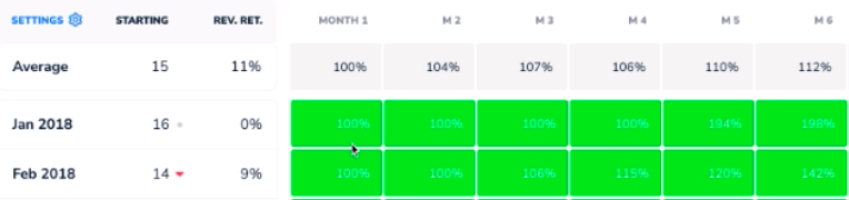
Here, the percentages will be listed relative to the cohort’s revenue in the first month. Therefore, the first value in any given column is listed as 100% - naturally, because in the first month, the cohort paid 100% of their first month’s revenue!
Remember that the M1, M2, etc. values still represent the same month in the customer’s life cycle, but with a bonus: it’s even more standardized when it’s listed in percentages, since each value is measured in comparison to the first month in the row. That makes it doubly easy to evaluate your progress. 🤩
Looking Forward
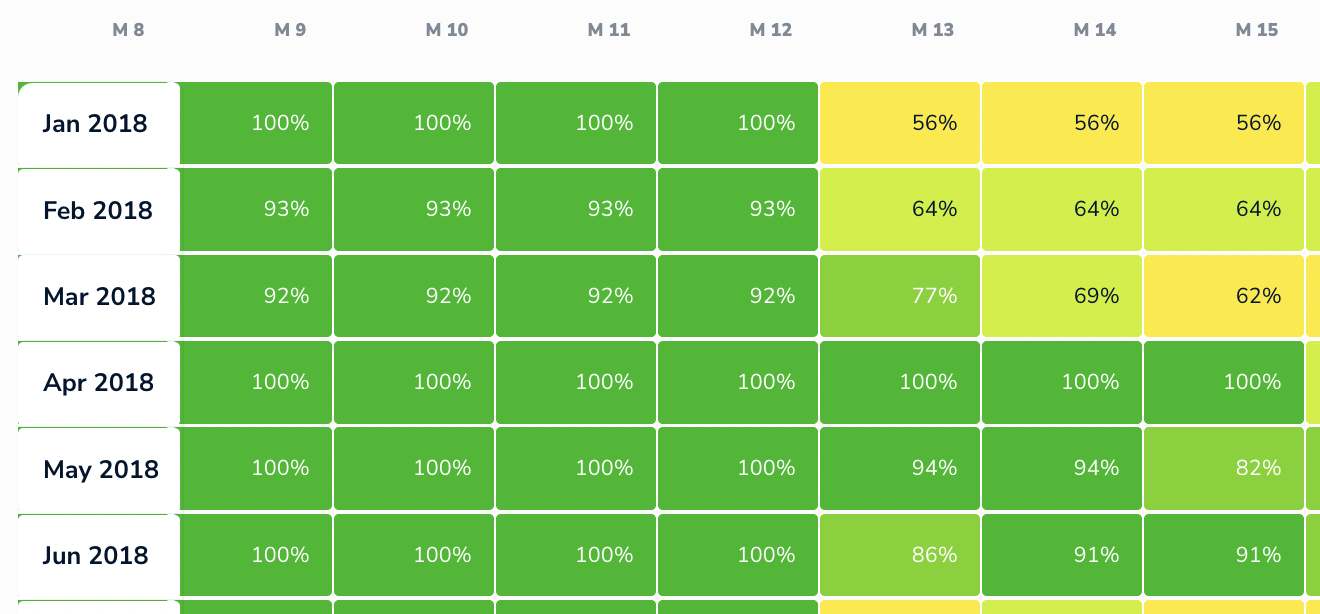
At M13, things start to get a bit more interesting. The 13th month is a key tipping point for many SaaS businesses, because customers often sign on to an annual contract, churning at the year’s end.
Give a quick glance to the January 2018 cohort. Their M13 value is 202%, which is awesome - that means they’ve more than doubled their revenue since the beginning of their contract! 💸

Some of the other numbers tell a different story, though. If you look at the June 2018 cohort, their M13 value was only 92%, meaning they’re generating 8% less revenue than they were when they started with you. July 2018’s value is even more stark, at just 64% of their original revenue 😕. At its core, a cohort chart is about retention!

What about Customer Retention?
The percentages we’ve been looking at thus far represent Net Revenue Retention (NRR) but we can also examine Gross Customer Retention (GCR, a.k.a. Logo Retention) with a cohort chart. If you need a refresher on these concepts, check out our overview of these key retention metrics here.
Subscript allows you to easily view cohorts by customer counts and % as well.
Let’s first look at Customer %; these values represent the percentage of customers acquired in a given cohort that stayed with you month-to-month.
Again, looking at M13 gives us valuable information. Scrolling to that column reveals a sudden wash of yellow, indicating some significant churn occurring at the end of contracts. The January 2018 cohort here shows only 56% GCR! 😬

The good news here is that even though Gross Customer Retention was pretty poor for this cohort, the NRR was very high (202%, if you recall from earlier). That means that the customers that left weren’t very high-paying, and the ones that stayed were the best customers.
On the flip side, that low GCR figure does provide critical information. Regardless of NRR, losing 44% of your customers is definitely cause to take action.
These cohort charts provide crucial insights into which business actions will be most helpful. Since our high NRR tells us that we kept the high-paying customers, we can now develop strategies to obtain more customers like them. By seeking out those stickier clients, we can mitigate future churn and see more green in our chart’s future! 🤑
Without the cohort chart to organize things, you’d only have a mess of jumbled numbers. With the chart, it’s much easier to see how these numbers relate to one another and progress across time.
Can I view customer retention in raw numbers?
Yes! The below chart shows the actual numbers of individual customers in each cohort over time.

In the chart above, we see that in February 2018 cohort’s M6, there were 14 customers. Notice that in that cohort’s M7, two of these customers dropped to leave 12. One month later in M8, one of those customers returns.
Up until now, we’ve been focused on columns, which show trends in customer’s life cycles.
The rows, however, show behavior patterns within each individual cohort.
To recap, we can look vertically at the chart for information about customer life cycles. We can look horizontally to investigate trends within cohorts. That leaves diagonal analysis - and that’s super useful too!
What can I learn from looking at diagonal trends?
Perhaps your business serves not-for-profits, and the momentum of Black Lives Matter impacted your business in some way, especially during Summer 2020. Or maybe you’re a travel agency that was seriously impacted by the beginning of the COVID-19 pandemic.
Those kinds of trends, which occur at a singular point in time, appear in a diagonal on the chart. Looking at the example cohort chart, we observe a diagonal trend that appears to begin in M30 for the January 2018 cohort - in other words, the trend begins in June 2020 (the 30th month after January 2018).

If June 2020 is represented by M30 for January 2018’s cohort, then that same month for February’s cohort is represented by M29. That cell will be located one step to the left and one step down from the first value. March 2018’s cohort value will appear one to the left and one down from there, and so on. 🗓
Can I change the time scale?
Absolutely! In addition to viewing your cohorts in months, you can also view them by quarter. This is helpful when you don’t get tons of new customers on a monthly basis. In those scenarios, dividing customers into cohorts based on longer time periods is helpful.
By the same token, you can also view the chart in years. This is particularly helpful for B2Bs, which typically operate on yearly contracts. You can then see how cohorts of yearly customers have fared in subsequent years. ⌛️
That all sounds awesome - but if cohort charts are so great, why don’t more people use them?
Put simply, they’re just extremely difficult to generate. Typically, cohort charts are completed in spreadsheet software like Excel.
When these charts are completed in spreadsheets, you’ll see a bunch of customers, months and revenue mixed together. Putting all that information into one cohesive chart in Excel is time-consuming, and you can only examine one variable at a time - so in order to see your customer numbers, percent revenue retention, and dollar retention separately, you’d need to make three separate charts.
Not only that, but updating with new data is a laborious and frustrating process in Excel. It’s dizzying to imagine all the work you’d have to do in Excel to turn your raw data into sensible cohort charts. You’d have to find formulas that determine which customers are new, in which month they were new, what their revenue looks like for each subsequent month, and then you’d have to make sure it all stops at the current moment. Yikes! 😩
It’s not impossible - some spreadsheet gurus can manage the task. In fact, that’s how we ran cohort analyses for several years at our previous B2B SaaS company. However, even for the experts, this process is a pain. It’s tons of work, and every time even the most minor change is needed, it's tons more work.
Even if you can find someone willing to do all that, it’s an affair highly prone to error - and when mistakes are made, they’re very hard to find until you’re knee-deep in your analysis. Imagine finding a tiny error in gigantic spreadsheets like these, and having to go back and debug all of it.
Summary
Does all that sound overwhelming? Not to us! At Subscript, one of our missions (inspired by our own painful past experiences doing cohorts) is to make this analysis as easy as possible for you. There’s no need to waste your time (or your sanity) doing these analyses on your own. ✅
